Fanta is ‘bold not boring’ with first ever brand identity
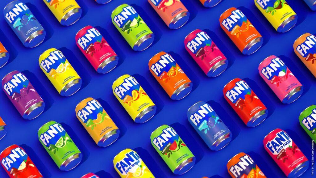
Fanta has ensured its new look is “bold not boring” as it introduces its first ever global brand identity, created by Jones Knowles Ritchie, the design-led creative company to bring a “consistent and cohesive” look to the brand.

The move is part of an ongoing strategy to unify the Fanta brand around the world, with a consistent brand identity and packaging, which will allow it to sit consistently alongside other Coca-Cola Company brands such as Coca-Cola and Sprite – which was also recently redesigned.
The fresh branding remains unmistakably Fanta, but has been carefully designed with the intention of inspiring people to find the fun in life with bright, bold designs that it says “punch through the routine of everyday life”.
The new logo and custom typography now embody the presence and personality of Fanta, but with a POP! The brand color system is comprised of unique and identifiable colors that provides the brand with an endless range of flavor possibilities.
The Coca-Cola Company recently rebranded classic soft drink brand Lilt as Fanta Pineapple and Grapefruit, a move which was met with dismay by many.
Related news
Coca-Cola invests again in Fairlife production
🎧 Hallgasd a cikket: Lejátszás Szünet Folytatás Leállítás Nyelv: Auto…
Read more >Coca-Cola Zero Zero is the new caffeine- and sugar-free version of Coca-Cola.
🎧 Hallgasd a cikket: Lejátszás Szünet Folytatás Leállítás Nyelv: Auto…
Read more >Carrefour and Coca-Cola are focusing on refillable glass bottles
🎧 Hallgasd a cikket: Lejátszás Szünet Folytatás Leállítás Nyelv: Auto…
Read more >Related news
KSH: in February the foreign trade surplus for goods was 665 million euros, the volume of exports was 2.3 percent lower, and that of imports was 6.7 percent higher than in the same period of the previous year
🎧 Hallgasd a cikket: Lejátszás Szünet Folytatás Leállítás Nyelv: Auto…
Read more >REGIO Játék: Families spend a maximum of ten thousand forints on Easter gifts
🎧 Hallgasd a cikket: Lejátszás Szünet Folytatás Leállítás Nyelv: Auto…
Read more >Péter Szijjártó: the domestic food industry is further strengthened with the investment of SUGO FOOD Kft. in Baja
🎧 Hallgasd a cikket: Lejátszás Szünet Folytatás Leállítás Nyelv: Auto…
Read more >


