Design revamp of the iconic American QSR

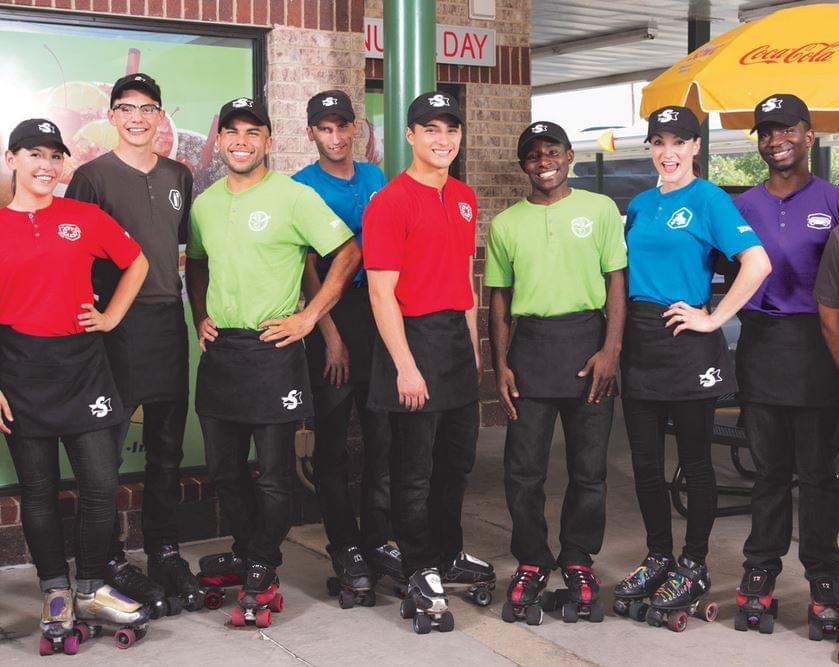
Vivid lights, digital displays, mobile ordering, quick, contactless ordering and payment – redesigned visuals and experience at Sonic drive-in. The classic roller skates waiters stay on place.
On the Insights pages published by Shop! HQ – mother organisation of POPAI Hungary – they report the detailed renewal of the iconic fast food chain also well known from movies. In the article the impact of the pandemic and the latest trends can be well traced with the contribution of Shop! member ChangeUp design and branding.
Typical American
Sonic is a real American success story. Founded in 1953 in Oklahoma, Sonic has risen to cover North America, Us and Canada, with over 3,500 locations.
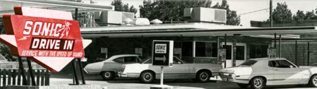
Besides typical QSR (Quick-Service Restaurant)features, like limited menus and quick service there are specifics like covered drive-in stalls, speaker system, and the food delivered by a carhop.
Bright, fresh, modern design
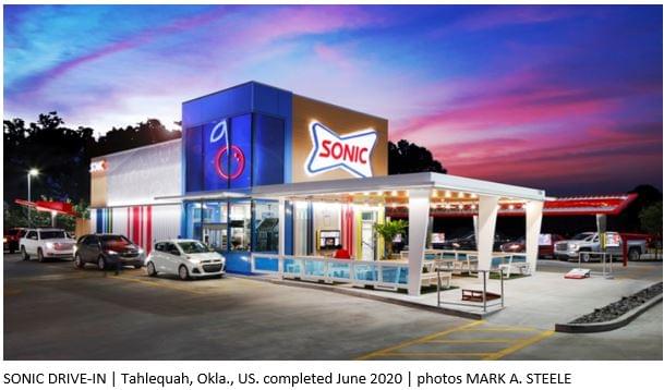
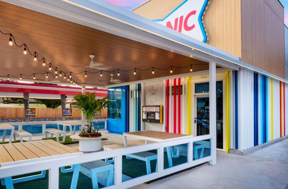
The refreshed positioning aims to provide a characterful customer experience based on entertaining gastronomy. Vivid vertical stripes, white-and-wood elements, and a brand identity overhaul have given drive-in chain Sonic a fresh, festive, thoroughly modern update.
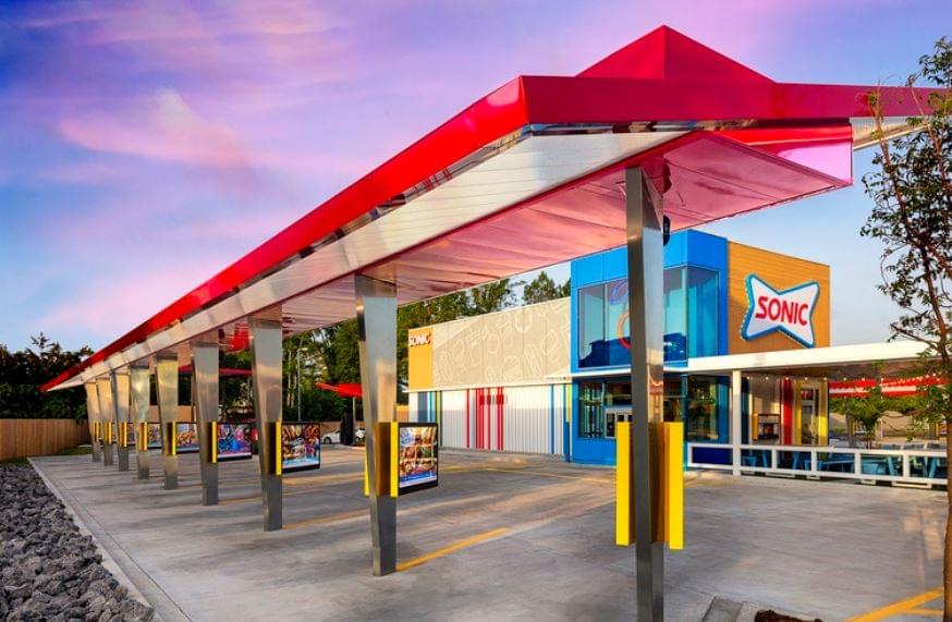
Drive-in docks outfitted with digital screens are situated parallely, covered by a red canopy. This area is especially appealing amid social distancing: Sonic’s Mobile Order Ahead platform facilitates quick, contactless ordering and payment.
A key component of the updated aesthetic is the addition of a blue glass tower featuring a brightly lit cherry. A nod to the 9 million Cherry Limeades that Sonic sells each year, the tower elevates the drive-thru and stands out at night. It allows for a look inside the building to get a peek at the kitchen’s hustle and bustle.
The chain’s bold new logo has a charm and quirkiness that’s all its own, and a bolder color palette, food and lifestyle photography, iconography, app design, and collateral such as the classic roller skates that carhops are permitted to wear all add to the fresh feel. The refreshed positioning aims to make everything about the chain a fun treat, punching up the red (for hot items) and blue ( for cold items) to create a delightful visual system of patterns, stripes, and icons that celebrate what makes Sonic special.
Movement and oasis
On the central building’s facade, vibrant lenticular stripe detailing creates the illusion of the building itself moving with customers, as it changes colors while they drive around the building. Standalone and wall-mounted outdoor signage features the Sonic logo prominently.
At the site’s center, a covered patio signals a “treat for your day.” A newer element for most Sonic locations, the outdoor oasis is outfitted with string lights suspended from a wood ceiling, a palm tree in a white planter, and white-and-wood tables and benches sitting on patches of faux grass. Lawn games add an experiential element to the covered space.
In addition to the redesign, which is part of a prototype project with multiple design options for locations across the chain, a modernized visual system may be the secret sauce. Sonic’s Mobile Order Ahead platform facilitates quick, contactless ordering and payment. A brand-new kitchen layout and optimized drive-thru enable Sonic teams to operate more efficiently, improving throughput and speed-of-service.
Related news
Wizz Air UK receives regulatory approval to operate flights to the United States
🎧 Hallgasd a cikket: Lejátszás Szünet Folytatás Leállítás Nyelv: Auto…
Read more >
Hello, who ordered the hamburger?
🎧 Hallgasd a cikket: Lejátszás Szünet Folytatás Leállítás Nyelv: Auto…
Read more >
Bottled Topo Chico shortage in the United States: The Coca-Cola Company suspends production until summer
🎧 Hallgasd a cikket: Lejátszás Szünet Folytatás Leállítás Nyelv: Auto…
Read more >Related news

International food prices have risen due to the impact of the Middle East conflict on energy prices
🎧 Hallgasd a cikket: Lejátszás Szünet Folytatás Leállítás Nyelv: Auto…
Read more >
Every twentieth instant payment is now processed through the Qvik system
🎧 Hallgasd a cikket: Lejátszás Szünet Folytatás Leállítás Nyelv: Auto…
Read more >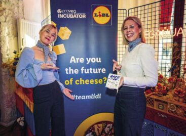
Oat-based “feta” wins the cheese innovation competition of Lidl Germany and ProVeg
🎧 Hallgasd a cikket: Lejátszás Szünet Folytatás Leállítás Nyelv: Auto…
Read more >