Wernesgrüner repositions itself
Following the launch of the “More connects us” campaign, Wernesgrüner Brewery is taking the next step in positioning the brand: it is now presenting itself in a completely new, modern design.
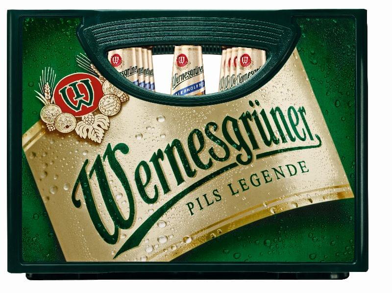
The new brand identity is deliberately intended to combine tradition and modernity and can be experienced across all channels: all Wernesgrüner products and sales units, as well as the entire external appearance, will be gradually converted, according to a statement.
The Wernesgrüner product range will be given “a clear and modern look that expressively stands out from the competition.” The guiding principle “More connects us” is now also to be reflected in the design through connecting elements: When people spend time together in a company, they like drinking Wernesgrüner together. This emotional social bond is now symbolized by a beer glass with a foam crown and the Wernesgrüner “W”.
For the first time, the brewery’s origins are explicitly emphasized: the Wernesgrüner brewery appears as illustration on bottles, cans, six-packs, and many other touchpoints, and thus has a fixed place in the design. During the design development, some significant elements such as the red quality seal, the diagonal Wernesgrüner lettering, and the date 1436 have been kept, further developed, and prominently integrated into the new design. The product-specific color design of the labels is also intended to provide greater differentiation between the beer varieties.
Katja Wüstling, Senior Brand Manager at Wernesgrüner, explains, “Some familiar design elements have been specifically elaborated and reinterpreted. They now form an ideal bridge between the new orientation and the long history of the brand.”
Related news
Donald Trump’s planned tariffs pose challenges for the US alcohol industry
US presidential candidate Donald Trump has proposed a 25% tariff…
Read more >
Beer consumption is decreasing in Germany and Europe
German beer culture is known around the world, but even…
Read more >Related news

Recognition of Consumer Protection Excellence: Honoring the Best of 2024
This year’s outstanding consumer protection officers and special award recipients…
Read more >
The Joy of Giving! – SPAR stores collect non-perishable food for people in need
The Hungarian Maltese Charity Service and SPAR Hungary have launched…
Read more >
KSH: industrial production decreased by 0.2 percent in October
In October, the volume of industrial production fell by 0.2…
Read more >