Magazine: Which one to like?
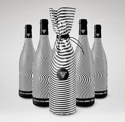
General world trends in packaging design prevail in Hungary as well, for instance we can see geometrical shapes, special motifs drawn using pastel colours or packaging paper carrying extra product information. This is good strategy as consumers have to choose from so many types of wine when standing in front of store shelves, and they rely not only on price and winemaker but also on how they feel about the label, to what extent they can identify with it. Wineries that target young people use creative, playful design on their labels. It is interesting to see how winemakers use design elements to differentiate various members of product series from each other. It is also a good idea to use graphic solutions for indicating what food (or mood) the wine is to be paired with.
Related news
Related news
Confidence in the SZÉP card remains unbroken, with 18 percent more payments made with it in February
🎧 Hallgasd a cikket: Lejátszás Szünet Folytatás Leállítás Nyelv: Auto…
Read more >The largest winery in the Eger wine region has opened a restaurant
🎧 Hallgasd a cikket: Lejátszás Szünet Folytatás Leállítás Nyelv: Auto…
Read more >(HU) Megújult az ÉS Bisztró a Kempinskiben
🎧 Hallgasd a cikket: Lejátszás Szünet Folytatás Leállítás Nyelv: Auto…
Read more >


