Restaurant on-line
We only discuss good web sites of good restaurants so that everybody can learn from the mistakes.
Choco Restaurantbar
Very “overdone” web site of a very overdone place. Brown and lilac shades, not unlike that of the chocolate brand, but the background music makes us forget the chocolate. Accessing information could not have been made any more complicated, though photos appear in a very creative way. Letters are micro sized. The thing we have found most confusing was the slogan “interactive feeling”.
Buffalo Étterem
There is something on this fairly low budget web site which most designers tend to forget: moving pictures. The western retro scene conveys the atmosphere of the steak house. Designers have made use of the full screen, though not very creatively. The text is rather simple, if not common and photos are amateurish. We can find all the info we need, except for drinks.
Gazdakör vendéglő, Pilisvörösvár
Not very exciting, but highly professional graphics. The style of the web site is definitely better than the rather eclectic interior of the restaurant. The site is up-dated regularly and all important info, like current offers is available. The satellite map is truly from the 21st century. Though the menu tries to be funny, there is not much personal about the web site. For example, we don’t know who the chef is.
Related news
Related news
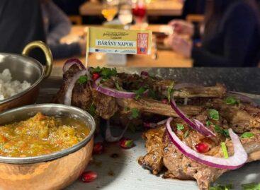
The 2026 Lamb Days program ended with record participation
🎧 Hallgasd a cikket: Lejátszás Szünet Folytatás Leállítás Nyelv: Auto…
Read more >New trend in tourism: Young travelers are no longer looking for a room, but for company in Europe
🎧 Hallgasd a cikket: Lejátszás Szünet Folytatás Leállítás Nyelv: Auto…
Read more >Recipes for Easter: dairy-, gluten- and sugar-free delicacies
🎧 Hallgasd a cikket: Lejátszás Szünet Folytatás Leállítás Nyelv: Auto…
Read more >


