Germany’s Globus Rebrands With New Logo And Corporate Design

German retailer Globus has launched a new corporate design and logo, which it says will convey modernity and transparency.
The retailer aims to roll out the new look at all market halls by the end of this year.
As part of the new look, the company has retained its traditional green and orange colours, with an expanded colour palette.
The logo features a dynamic globe and the lettering is in rounded uppercase.
The new corporate design includes new colours, shapes, images and fonts, and will apply to all areas of its stores – from the small price tags on the shelf to the large advertising posters.
ESM

Related news
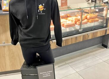
From the shopfloor: How to create customer loyalty beyond price competition
🎧 Hallgasd a cikket: Lejátszás Szünet Folytatás Leállítás Nyelv: Auto…
Read more >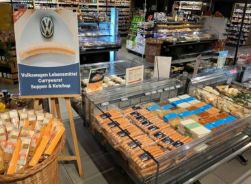
From the shopfloor: Volkswagen expands its grocery business
🎧 Hallgasd a cikket: Lejátszás Szünet Folytatás Leállítás Nyelv: Auto…
Read more >
Suzuki Motor Corporation changes its logo after 22 years
🎧 Hallgasd a cikket: Lejátszás Szünet Folytatás Leállítás Nyelv: Auto…
Read more >Related news

Big shopping begins, trade is prepared
🎧 Hallgasd a cikket: Lejátszás Szünet Folytatás Leállítás Nyelv: Auto…
Read more >
Nearly one and a half kilograms of ham and two dozen eggs: this is how Hungarians prepare for Easter
🎧 Hallgasd a cikket: Lejátszás Szünet Folytatás Leállítás Nyelv: Auto…
Read more >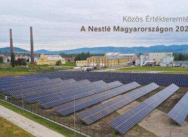
The goal is to improve the quality of life for generations: Nestlé’s summary of shared value creation has been published
🎧 Hallgasd a cikket: Lejátszás Szünet Folytatás Leállítás Nyelv: Auto…
Read more >