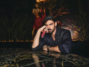
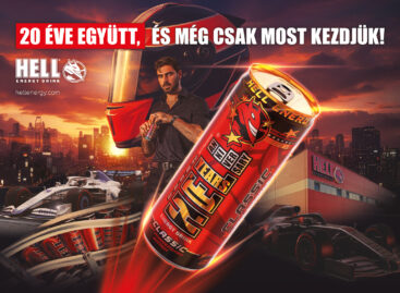
HELL CITY has arrived, led by Michele Morrone
HELL celebrates its 20th anniversary in 2026 and does not look back, but opens the door. The brand launches its latest unified communication platform: HELL CITY, a cinematic, expandable brand universe that organizes HELL’s presence and community – consumers from over 60 countries – into a shared story. At the helm of the city is Michele Morrone, the leader of HELL CITY: he is the international face who introduces you to this world and shows you what it means to be a “HELL” today. HELL is present in the everyday lives of millions of people around the world: in mornings, on trips, at work, at school, at sports, at nights, in every moment when it is needed, and HELL CITY elevates this shared experience into a single, grand, common framework.
 The basic idea of HELL CITY is simple, yet it works immediately: imagine a city where HELL not only appears, but surrounds you. Where style, confidence and iconic moments of everyday life speak the same language. Here, HELL is more than a drink: a common code. Something you understand when you’re in it. And something you want to connect to.
The “city” as a frame works so well because it naturally brings the experience of belonging: we arrive, we return, it feels familiar, and in the meantime something always happens that makes us look further, go further, enter again. HELL CITY organizes everything that says HELL under one title in this logic: the appearance, the storytelling and the world of the brand, while also giving space to local voices. In this way, consumers do not just receive messages: they become part of the city and can experience as a community that HELL connects them.
At the gate of HELL CITY, Michele Morrone welcomes you, in an emphatic, decisive role. He does not simply appear as an advertising face, but as the character of HELL CITY: he is the international face who guides us through the world of the city, and who shapes HELL’s style, character and clean quality into a single, instantly recognizable presence. Morrone’s role is a clear message: HELL is global, premium and contemporary, yet human, a world connected to everyday life, to which consumers can easily relate.
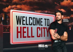 The visual appearance of HELL CITY is modern and striking: full of neon lights, cinematic, clean and instantly recognizable. Cinematic visuals and detailed world building, an atmosphere that simultaneously evokes iconic images of big city nights and the familiar feel of urban worlds in the hottest video games. A space where different generations and lifestyles meet: a cool, dynamic, desirable world whose atmosphere is instantly intoxicating.
“HELL has grown into a global community over the past 20 years, and now we want to give this community a real home. HELL CITY is not a campaign, but a unified, continuously expanding brand universe: from major announcements to everyday content, from product innovations to cultural collaborations, everything fits into the same world, with a consistent voice and a unified visual system. This common title allows our consumers, wherever they live, to connect with the same story and experience HELL as a community. Michele Morrone is not just ‘in’ this city: he is the defining face and character of HELL CITY, the presence that makes it clear at a glance what HELL stands for today, and where are we going next.”
– said Adrienn Popovics, HELL’s international communications and marketing director
Related news
HELL’s anniversary limited edition box was created with the collaboration of Michele Morrone
🎧 Hallgasd a cikket: Lejátszás Szünet Folytatás Leállítás Nyelv: Auto…
Read more >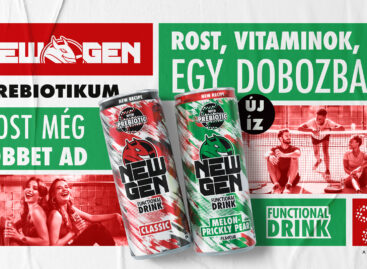
HELL NEW GEN is renewed with prebiotics – a new flavor is also coming
🎧 Hallgasd a cikket: Lejátszás Szünet Folytatás Leállítás Nyelv: Auto…
Read more >
YouGov Brand Footprint 2025: the favourite FMCG brands of shoppers
🎧 Hallgasd a cikket: Lejátszás Szünet Folytatás Leállítás Nyelv: Auto…
Read more >Related news
How will we pay for coffee in 2030, and will Europe finally get its own financial infrastructure?
🎧 Hallgasd a cikket: Lejátszás Szünet Folytatás Leállítás Nyelv: Auto…
Read more >
The government supported food industry developments with more than one thousand billion forints
🎧 Hallgasd a cikket: Lejátszás Szünet Folytatás Leállítás Nyelv: Auto…
Read more >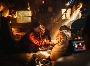
While the world changes, the shared experience is eternal: Unicum’s new commercial debuts with a journey across universes
🎧 Hallgasd a cikket: Lejátszás Szünet Folytatás Leállítás Nyelv: Auto…
Read more >