Restaurant on-line
We only discuss good web sites of good restaurants so that everybody can learn from the mistakes.
Hemingway (Budapest)
Carefully designed, even a little too sophisticated web site. Letters are not large enough, or possibly, our eyes are weak…However, we are told everything we need to know and the photos are good. We still don’t think it is a good idea to communicate the food and beverage assortment in pdf format. The impression we get from the web site is that of professionalism, mixed with a little exhibitionism.
Söröző a rókalyukhoz (Sopron)
Though the image is a little childish, we see a professionally run place. The menu system is transparent and easy to use. All important information is easily accessible. Unlike in many other restaurants, it is possible to place orders online. The text is also a little childish, but this is forgivable since it is intended to make communication easy. Photos are far from professional, but still function well.
Bécsikapu (Kőszeg)
Perseverance is needed if you want to obtain information from this web site. This is not because information is hard to access, but because music is loud and impossible to turn off. . The menu system offers plenty of information for those who tolerate the monotonous repetition of music. Letters and photos could be larger. However, all significant information can be found quickly and easily. Use ear plugs and glasses.
Related news
Related news
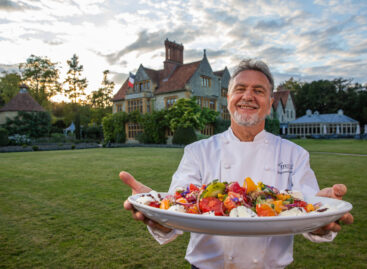
Unmissable Easter dishes from three world-famous chefs
🎧 Hallgasd a cikket: Lejátszás Szünet Folytatás Leállítás Nyelv: Auto…
Read more >(HU) Kávés kávé – A nap képe
🎧 Hallgasd a cikket: Lejátszás Szünet Folytatás Leállítás Nyelv: Auto…
Read more >(HU) Instant grillvacsora – A nap videója
🎧 Hallgasd a cikket: Lejátszás Szünet Folytatás Leállítás Nyelv: Auto…
Read more >


