Restaurant on-line
We respect restaurants which take the trouble of regularly up-dating their web sites. We only discuss good web sites of good restaurants so that everybody can learn from the mistakes.
Nagy Levin, Budapest
This web site is quite difficult to read, because the text itself is unreadable and often lacks the very information it is supposed to contain. Colours are harmonic, background music is pleasant, while the quality of photos is very diverse. The web site does not appear to be the work of the Great Levin… (www.nagylevin.hu)
Mozivilág, Kaposvár
Not a very complex site, but decent. Letters should be easier to read. All important info is accessible quite easily, but the menu is a little complicated. A little more creativity would have been welcome. (www.somogy.hu/mozivilag)
El Mariachi, Szentendre
Once you succeed in finding the navigation menu, everything is OK. From there on, the site is easy to use. Photos are great and can be enlarged to full screen. It is a good idea to put a very positive press article on the opening page, but forgetting about its source is not such a good idea…
(www.elmariachi.hu)
Related news
Related news
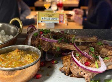
The 2026 Lamb Days program ended with record participation
🎧 Hallgasd a cikket: Lejátszás Szünet Folytatás Leállítás Nyelv: Auto…
Read more >New trend in tourism: Young travelers are no longer looking for a room, but for company in Europe
🎧 Hallgasd a cikket: Lejátszás Szünet Folytatás Leállítás Nyelv: Auto…
Read more >Recipes for Easter: dairy-, gluten- and sugar-free delicacies
🎧 Hallgasd a cikket: Lejátszás Szünet Folytatás Leállítás Nyelv: Auto…
Read more >


