Packaging in three steps – part 3: illustrating flavour
Many types of illustrations exist in many styles and with many different purposes. Illustrating flavour is a relatively new development. This modern method is barely 50 years old. Even at the and of the 80’s, illustration was used only for special flavourings, like banana flavoured chocolate. Flavour illustration can not only appeal to our target group but also to people who have no intention of buying our product. This is how we generate impulsive purchases. It should not be confused with product illustration which informs and orientates, whereas flavour illustration influences our emotions. Flavour illustration combines positive product attributes with a special atmosphere. Both promise a little more than is actually delivered, but appeal to our inner vision successfully. Modern designs are simple and composed of a few elements. They focus on the product’s main strength, while the mental message remains in the background. There is a lot of light and contrast, like a summer morning in Toscana. If you have also read parts 1 and 2 of this article about packaging, you might as well start working on your own designs at home. If you haven’t, I strongly recommend that you contract a specialist!
Related news
Related news
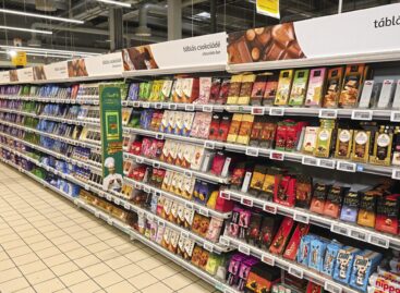
Shoppers loved chocolate bars
🎧 Hallgasd a cikket: Lejátszás Szünet Folytatás Leállítás Nyelv: Auto…
Read more >Revolut opens a Hungarian branch, transfers become more expensive
🎧 Hallgasd a cikket: Lejátszás Szünet Folytatás Leállítás Nyelv: Auto…
Read more >EWG report: Spinach leads the “Polluted Twelve,” pineapple tops the “Clean Fifteen”
🎧 Hallgasd a cikket: Lejátszás Szünet Folytatás Leállítás Nyelv: Auto…
Read more >


