Suzuki Motor Corporation changes its logo after 22 years

Suzuki Motor Corporation is changing the logo used on its products after 22 years, the company announced on its website on Monday.
 Suzuki Motor Corporation has redesigned its logo for the first time in 22 years, the company said in a statement. The new logo retains the brand’s recognizable shape and iconic “S” letter, but adopts a flat design in the spirit of the digital age, and replaces traditional chrome with a high-gloss silver paint to reduce environmental impact, expressing a shift towards a new era.
The new logo will first be displayed on Suzuki concept models to be unveiled at the Japan Mobility Expo, which runs from October 31 to November 9 in Tokyo.
Related news
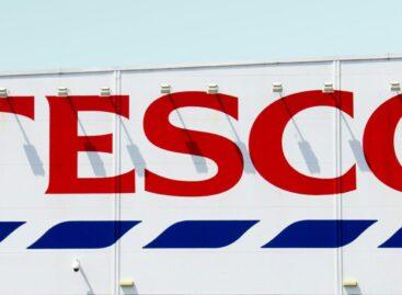
Tesco’s Clubcard program is undergoing significant changes due to legal proceedings
🎧 Hallgasd a cikket: Lejátszás Szünet Folytatás Leállítás Nyelv: Auto…
Read more >
At the top of product packaging – Picture of the day
🎧 Hallgasd a cikket: Lejátszás Szünet Folytatás Leállítás Nyelv: Auto…
Read more >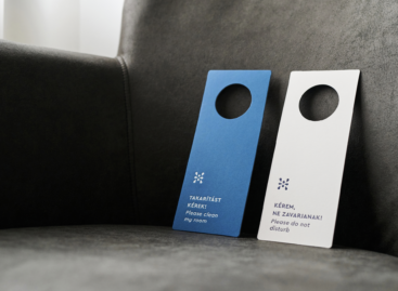
The image of Hunguest Hotels won a prestigious international award
🎧 Hallgasd a cikket: Lejátszás Szünet Folytatás Leállítás Nyelv: Auto…
Read more >Related news

International food prices have risen due to the impact of the Middle East conflict on energy prices
🎧 Hallgasd a cikket: Lejátszás Szünet Folytatás Leállítás Nyelv: Auto…
Read more >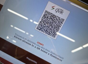
Every twentieth instant payment is now processed through the Qvik system
🎧 Hallgasd a cikket: Lejátszás Szünet Folytatás Leállítás Nyelv: Auto…
Read more >
Oat-based “feta” wins the cheese innovation competition of Lidl Germany and ProVeg
🎧 Hallgasd a cikket: Lejátszás Szünet Folytatás Leállítás Nyelv: Auto…
Read more >